

TL;DR
Why are stock photos failing my campaigns?
Probably a lack of ad creative testing. The images are too perfect to be real; generic imagery triggers ad blindness, making your ads invisible and tanking your ROI.
What exactly is Visual Psychology in PPC?
It’s the art of triggering a “this feels right” gut reaction in milliseconds using subconscious cues like lighting and local architecture.
How does Nano Banana help me create ultra personalized ad creative?
It localizes ads by swapping generic backgrounds for regional details, like specific roof styles, so you look like a local expert.
What’s the “Mirroring Effect” in ad creative?
Adjusting visuals to match a user’s current reality, such as shifting image lighting to “evening glow” for late-night browsers.
How do I move beyond prompting Nano Banano to strategizing with it?
Stop asking for “cinematic” vibes in your images and start testing specific hypotheses by changing only one psychological variable at a time.
Your Ads Look Like Everyone Else’s & It’s Killing Your ROI. Here’s the Fix.
You open your Performance Max campaign, go to the Images section, and reach for the stock library. Within seconds, you’ve found him: the Friendly Contractor. Crisp uniform. Oversized smile. Pipe wrench held like a trophy.
He’s the same photo your three nearest competitors are running right now.
The problem is not the quality of the image; it’s the familiarity. Your audience has seen this image so many times that their brains have learned to skip it entirely. This is ad blindness, and for local service businesses, it’s a quiet budget drain. When your creative looks like a template, your click-through rate (CTR) follows suit, and your cost per acquisition (CPA) climbs because you’re paying for impressions that never convert.
The fix isn’t finding a better stock photo. It’s applying real ad creative testing using the psychological triggers that make people stop scrolling in the first place.
Visual psychology isn’t some high-brow academic concept reserved for enterprise agencies with massive creative departments. It’s simply the study of how tiny, subconscious visual cues, the warmth of a sunset, the presence of a “lived-in” kitchen mess, or the visible steam from a coffee cup, tell a story of trust or friction to a potential customer.
With Nano Banana, we’ve moved past the era of “settling” for what’s available in a library. We are now in the era of the Creative Laboratory. Don’t think of Nano Banana as just an image generator; it can be a high-speed tool that allows you to stop guessing what your audience likes and start testing the specific psychological triggers that actually make them stop scrolling.
What’s Actually Driving Ad Blindness
When a potential customer scrolls past your ad, their brain decides in milliseconds before reading the ad copy or evaluating the offer. It runs a rapid gut-check: Does this feel relevant to me?
Visual psychology is the study of why some images pass that check, and others don’t. It’s not about resolution or production value, but about specific visual cues such as lighting, setting, atmosphere, and architectural detail that trigger trust or friction before a single word is read.
Tools like Nano Banana make ad creative testing practical at the speed a real campaign demands.Instead of waiting months for a photoshoot, you can generate multiple creative variants, each testing a different psychological trigger, and run them against each other in a live Google Ads environment.
Here are the three triggers that matter most.
- Contextual Relevance
When someone sees your ad, their brain scans the environment in the image for confirmation that you belong in their world. They’re not just evaluating your offer; they’re checking whether your service exists in their reality.
A house with cedar shingles and maple trees signals one thing to a homeowner in Vermont. To a homeowner in Phoenix, it signals that you don’t know their market.
This visual mismatch is subtle but costly. When the setting in your image doesn’t match the viewer’s environment because it features the wrong architecture, vegetation, or climate, their brain registers you as a generic national provider, not a local expert. You lose the trust battle before they’ve read your headline.
With Nano Banana, you can take one strong base image and adapt it for specific markets: swap cedar shingles for Spanish barrel tiles, replace a green lawn with drought-resistant landscaping, and adjust the sky for a different climate. That’s ad creative testing applied to something most businesses never think to test: whether the image even looks like it belongs in the customer’s neighborhood.
- Cognitive Load
Stock photos are often visually cluttered. Common examples include a kitchen with too many gadgets on the counter, a backyard with a distracting fence in the frame, and a living room where a bright red pillow pulls attention away from the service being offered.
That clutter creates cognitive load. You’re asking the viewer’s brain to work too hard to find the point of the ad. When they can’t identify the focal point within a second, they don’t lean in; instead, they scroll past. A confused viewer does not click.
Nano Banana can work as a cleanup tool. Instead of discarding a strong image because the background is messy, you can strip out distracting elements, clarify the focal point, and reduce visual noise. A cleaner image lowers the barrier to engagement and makes your call to action the natural next step rather than a puzzle to solve.
- The Mirroring Effect
People respond to images that reflect their own reality or their desired future state. When an ad mirrors the viewer’s current context, such as their home style, their time of day, or their situation, it stops reading as an advertisement and starts reading as a solution.
This goes beyond demographic targeting. It’s about atmospheric alignment.
For example, take one high-performing base image and create time-of-day variants using Nano Banana:
- Morning version: Bright, high-energy lighting for users browsing at 6 AM.
- Evening version: Warm, settled tones for users browsing at 9 PM.
- Demographic version: Use the brush tool to adjust the people in the scene to match the specific audience in each ad group.
This makes the same ad more relevant to different people at different moments. This idea of testing the atmospheric setting of your images is drawn from the research of marketing pioneers like Philip Kotler in his study of “Atmospherics as a marketing tool,” which found that the environment (lighting, colour, “vibe”) can be more influential than the product itself in triggering an emotional response that leads to a purchase. And Rolf Reber in his study of “Processing fluency and aesthetic pleasure”. This study shows that “fluent” stimuli (things that are easy to process because they fit the environment) are perceived as more pleasing and trustworthy.
Three A/B Tests to Run This Week
The three tests below are a starting framework for ad creative testing at the image level. Each one is built around a specific psychological hypothesis, a defined control, and a clear metric to watch. Run them in sequence or simultaneously depending on your campaign structure.
Test A: Seasonal Match vs. Evergreen Asset
Hypothesis: Users are put off by images that don’t match their current physical environment. A green lawn during a snowstorm signals irrelevance.
Control: Your current best-performing evergreen image.
Variant: Use Nano Banana to season-shift the same image. Add snow to the roof and a darker winter sky; add fresh greenery and bright midday light in spring.
What to watch: Click-through rate (CTR). If the seasonal variant outperforms, it confirms that environmental relevance is a stronger trigger for your audience than polished production value.
Test B: Pristine vs. Lived-In
Hypothesis: For service businesses, an image that looks too perfect creates a trust gap. A lived-in scene feels more authentic and approachable.
Control: A clean, professional photo of a kitchen, living room, or workspace.
Variant: Add small life details using Nano Banana, such as a coffee cup on the counter, shoes by the door, and a laptop open on the table.
What to watch: Conversion rate. Does the humanized version drive more form fills? People aren’t buying a showroom. They’re buying a solution that fits into their actual lives.
We ran this exact test at Hop Skip Media, here’s a breakdown:


Image B: Lived-in image
Hypothesis: For service businesses, an image that looks too perfect creates a trust gap. A lived-in scene feels more authentic and approachable.
Control: A clean, professional photo of a motorcycle in a showroom. with zero extra details
Variant: Add small life details using Nano Banana, showing the rider and the motorcycle out on the open road
Results: The lived-in variant received nearly 3x the impressions of the generic control, a strong early signal that the algorithm recognized higher engagement potential in the humanized image. Testing is still ongoing, and we’ll report back with deeper findings as more data comes in, but the initial direction supports the hypothesis: people aren’t buying a showroom. They’re buying a solution that fits into their actual lives.
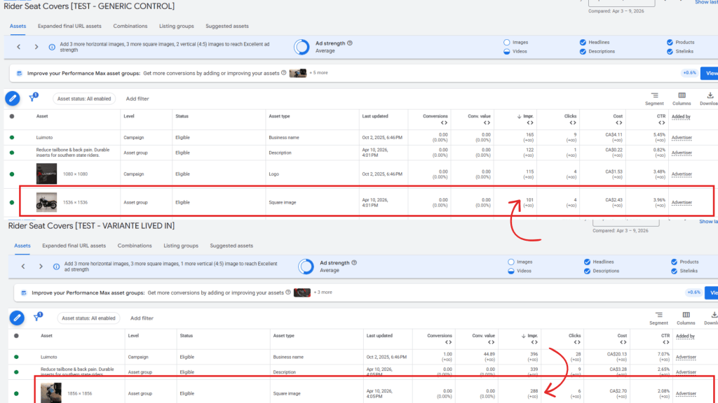
What to watch if you run this yourself: Conversion rate. Does the humanized version drive more form fills?
Test C: Value Tier Alignment
Hypothesis: If your imagery looks too luxurious, mid-market customers assume you’re out of their price range and won’t click. If it looks too budget, premium clients keep scrolling.
Control: Your current standard professional image.
Variants:
- Premium shift: Update countertops to marble, add high-end architectural lighting.
- Approachable shift: Simplify finishes to clean, modern materials without luxury cues.
What to watch: Lead quality. Are you attracting the customer segment you’re actually targeting?
Moving from “Prompting” to “Hypothesizing”
The most common mistake with AI image tools is treating them like a design shortcut rather than an ad creative testing instrument. Spending time on prompts like “make it more cinematic” without a testing rationale produces output, not insight.
That approach doesn’t pay for itself. To get measurable ROI from your ad creative, stop asking ‘how can I make this image look better?’ and start asking ‘what specific barrier is stopping my customer from clicking?’
Step 1: Identify the friction point
Look at your current campaign data. Low CTR usually signals one of three problems:
- Skepticism: The image looks like a national franchise, not a local expert.
- Apathy: It looks identical to every other ad in the category.
- Confusion: It’s unclear what service is actually being offered.
Step 2: Match the visual fix to the friction
- Skepticism: Localize the architecture and landscaping to match the target zip code.
- Apathy: Review competitor ads in Google Ads Transparency Center and Facebook Ads Library, then build a creative that deliberately breaks the category template. Learn more about effective creative strategy here: Why Copying Competitors is Ruining Your Facebook Ads Creative Strategy
- Confusion: Strip out background clutter so the product or technician is the undisputed focal point.
Step 3: Test one variable at a time
This discipline is what separates genuine ad creative testing from creative production. When you generate your new images in Nano Banana, change one thing at a time. If you change the lighting, the season, and add a new person all at once, you won’t know which change actually drove the performance lift. Create a “Clean Variant”: an image identical to your control, except for the one psychological trigger you are testing.
In Google Ads, set this up as a new Asset Group (the image-and-copy bundle within your Performance Max campaign) or as an Ad Variation in a Search or Display campaign. Run variants head-to-head for at least two weeks, or until you have enough data to trust the result, before calling a winner.
Nano Banana is a shortcut to testing creatives, but it’s not a shortcut to strategy. The more intention you put into your “hypotheses,” the less time you’ll waste on “prompts” that don’t convert.
The ROI of Iteration: From “Good Enough” to “Psychologically Proven”
The competitive advantage in Google Ads isn’t shifting toward better bidding scripts or more granular keyword lists alone. It’s shifting toward more resonant creative.
For years, local service businesses were stuck with whatever stock photo looked least generic, because commissioning a custom shoot for every seasonal change or audience segment was impossible to justify. AI image tools remove that constraint. Your ad creative is no longer a fixed production cost, it’s a testable variable. Treating it as such, with the same discipline you apply to headlines and offers, is what ad creative testing actually means in practice. The businesses pulling ahead in local service advertising aren’t the ones with the biggest creative budgets. They’re the ones iterating fastest on what’s already in market.
The goal isn’t better-looking ads. It’s finding the specific visual detail: the right lighting, the right local architecture, the right lived-in atmosphere, that makes your specific customer stop scrolling and start paying attention.
At Hop Skip Media, we treat ad creative the same way we treat bidding strategy: as something you test, measure, and improve. We use tools like Nano Banana to identify the specific visual details that are costing your campaigns clicks: the wrong setting, the wrong atmosphere, the wrong signal for your market. Then we fix them.
Book a clarity call and we’ll audit your current ad creative testing approach to show you exactly where visual friction is costing you leads.
This is very true because many ads look the same and people ignore them. If we make ads simple, different, and clear, more people will notice and click. Good ideas and a clear message can improve results and get better ROI.